PEEPS
Fostering connections for the UC San Diego student community with their campus, the San Diego area, and fellow students.
0-1
B2C
MOBILE DESIGN

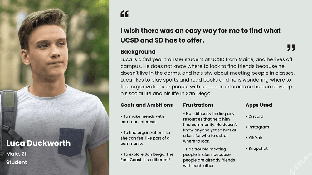
How might we create an application that can provide the UCSD student community with a more well-rounded, fulfilling, and support college experience?


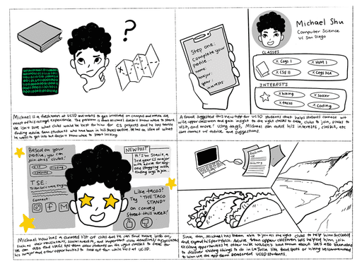
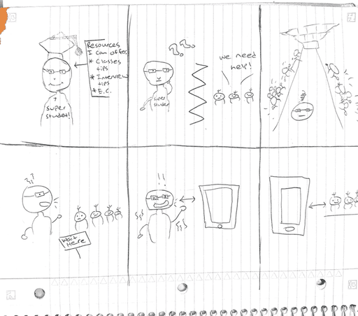
Storyboarding
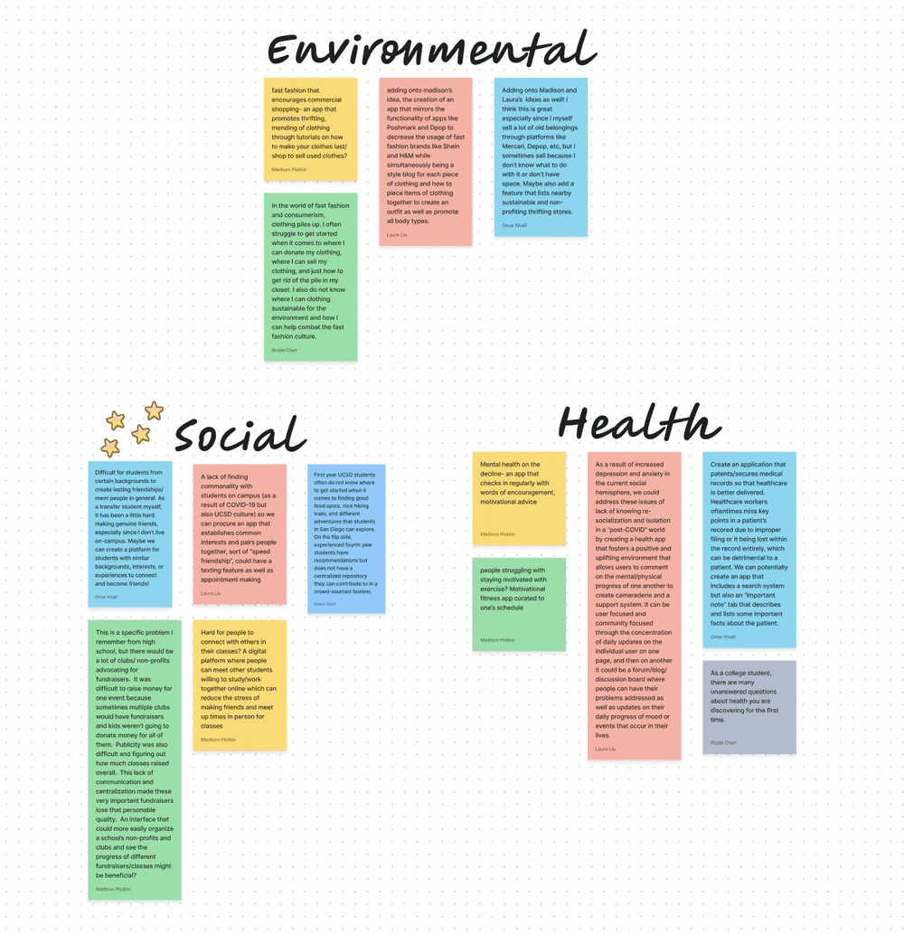
To bring our ideas to life, my team and I illustrated two storyboards that captured the user journey and showcased how people might interact with our key features in real-world scenarios. These storyboards didn’t just visualize possibilities but rather they grounded our vision.
They became my compass as I transitioned into wireframing and building low-fidelity designs, acting as a reminder of the user outcomes we were designing for and the impact we hoped to make once the platform launched.
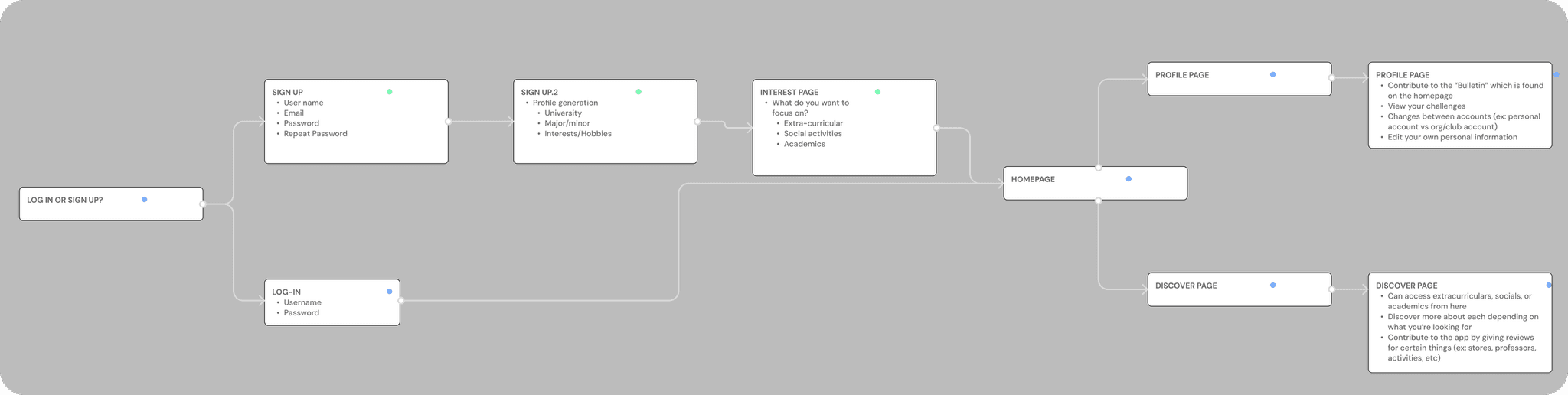
User Flow
Before diving into design iterations, I mapped out a detailed end-to-end user flow to ground our vision. I focused on simplifying the experience, breaking down each step a user would take and outlining what they'd see on every page.
This rough blueprint became our north star, helping me identify the essential features to prioritize and giving our team a clear direction as we began shaping the interface, allowing me to craft a journey that felt intuitive and intentional from the very start.
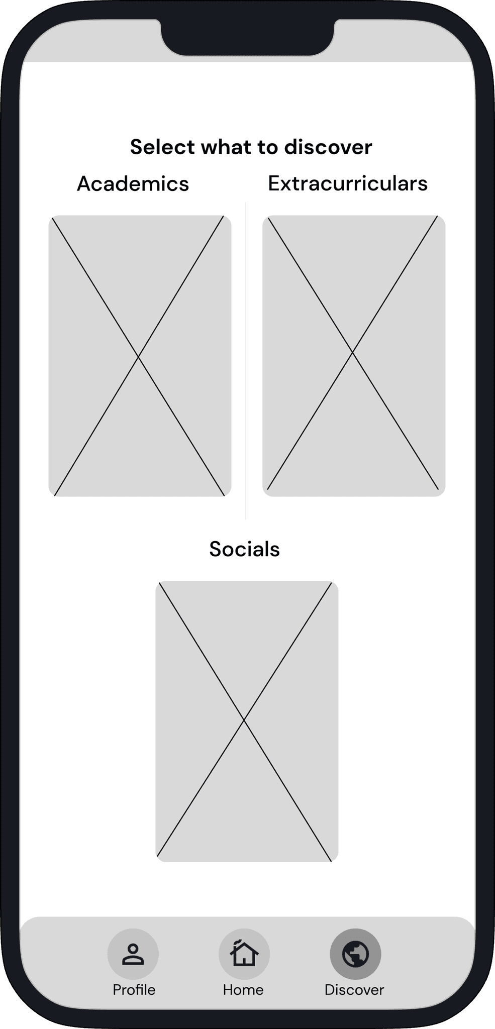
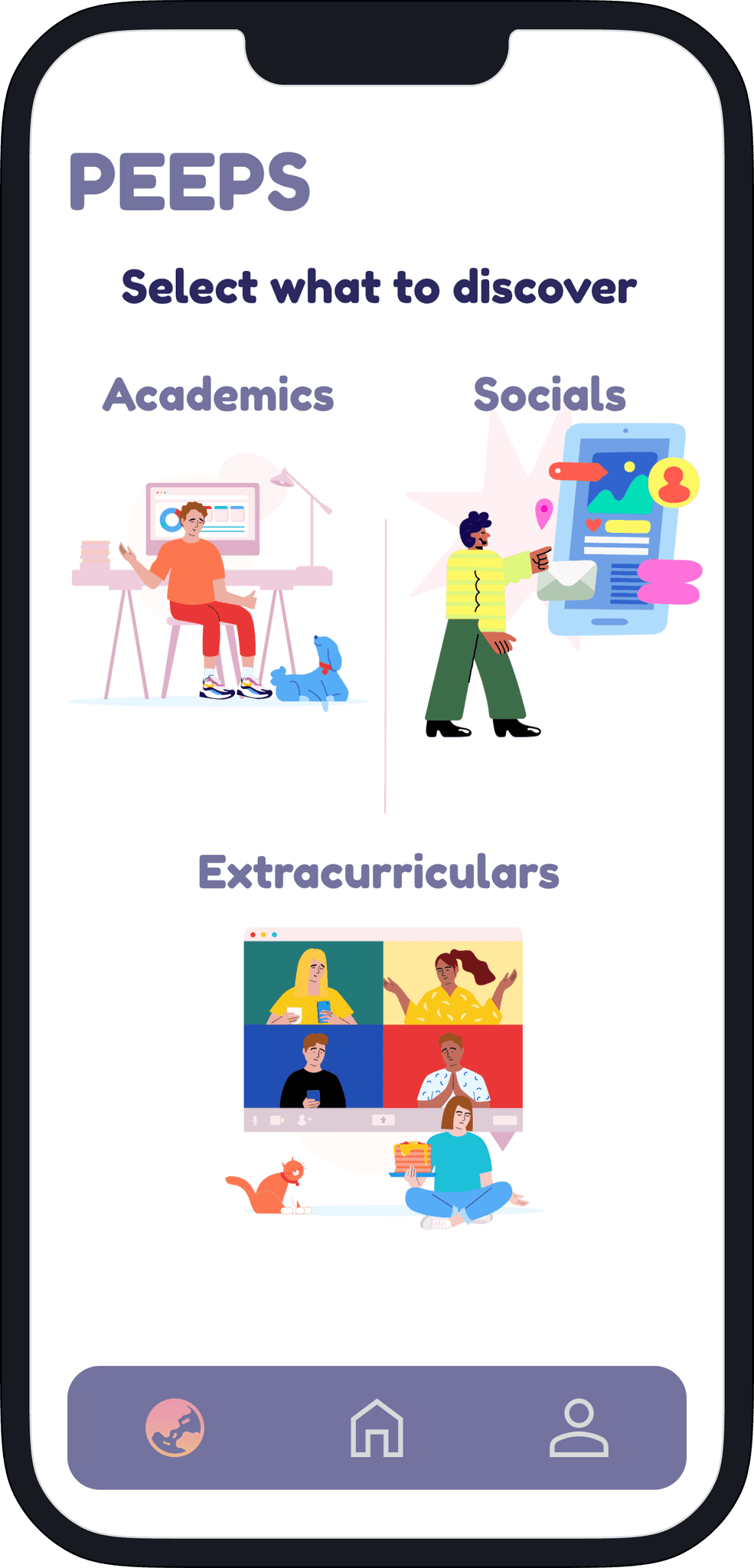
Wireframing + Lo-Fi Prototyping
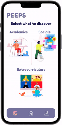
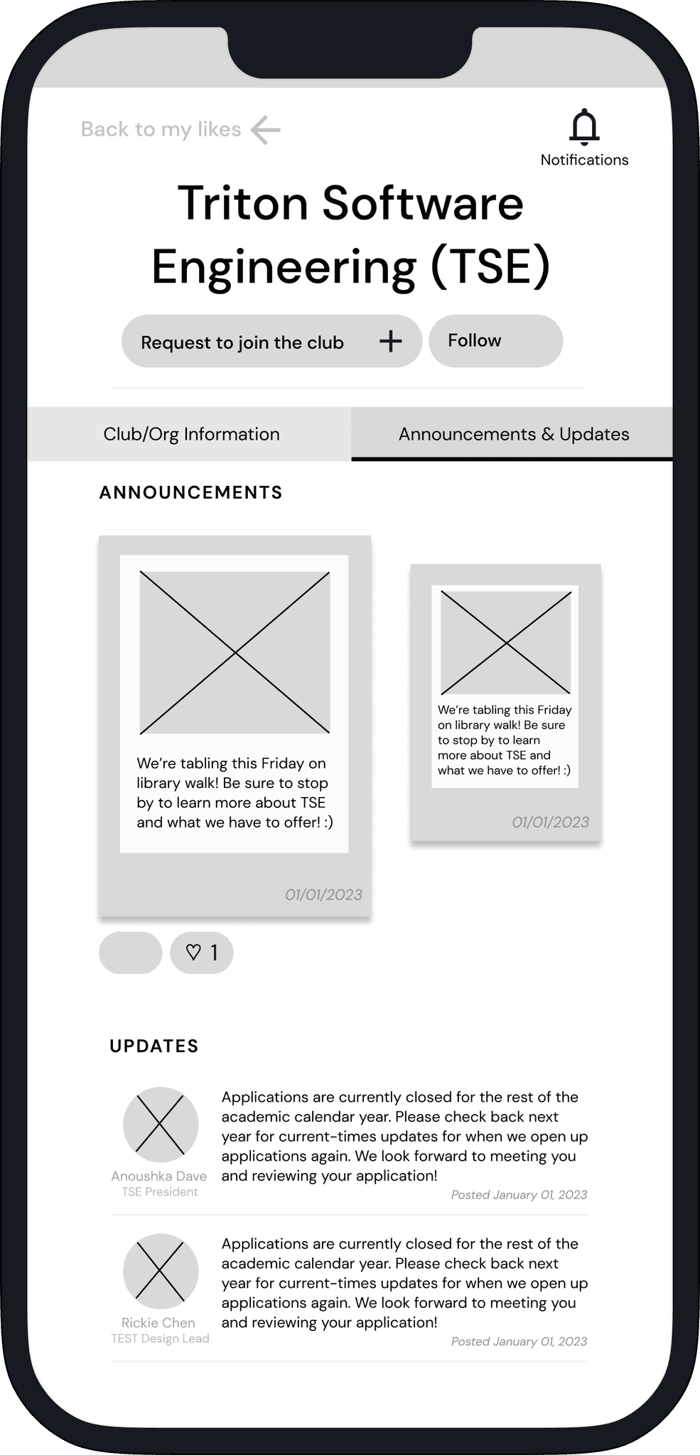
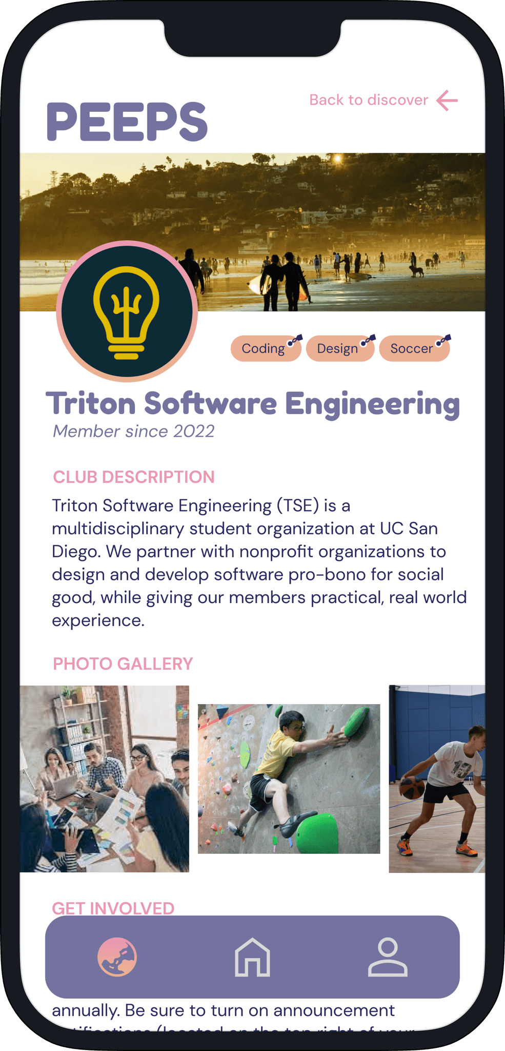
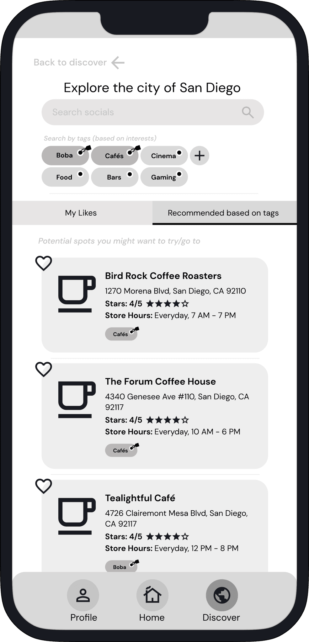
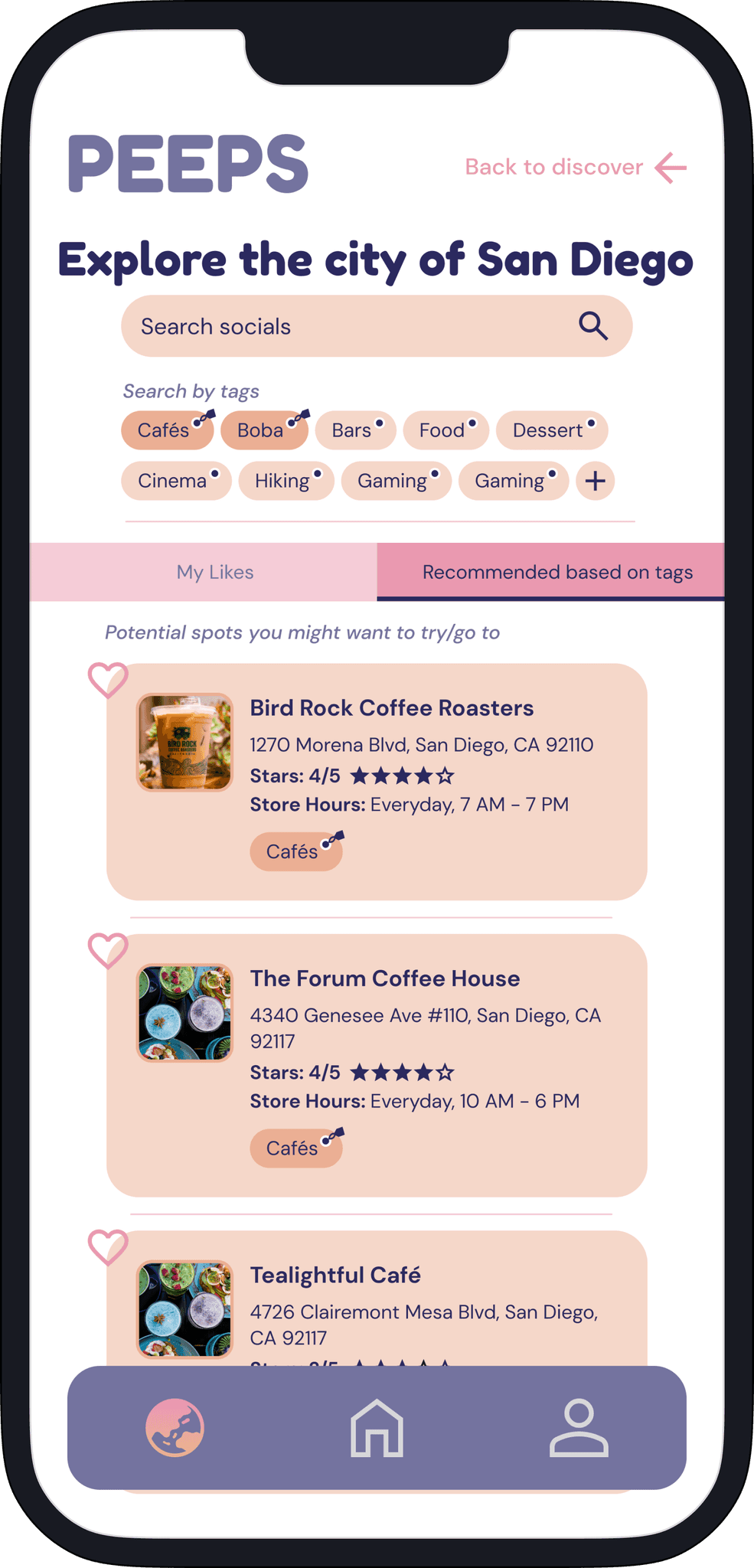
As our team divided up the app’s core features—profile, home, and discover—I took the lead on the Discover page, where I saw an opportunity to help users feel more connected to campus and the city beyond. My goal was to make exploration feel effortless and exciting.
I began by diving into user needs and aligning them with our product vision. From there, I crafted wireframes that encouraged meaningful engagement—whether users were looking for a new class, club, or weekend plan. I iterated through multiple versions, bringing early drafts to team discussions, collecting feedback, and refining the experience with each round.
By version 4, I had developed a streamlined lo-fi prototype that emphasized clarity, utility, and joy. The Discover page was split into three key sections:
Academics: Search courses by department, view professor reviews from students, and save favorites for quick reference.
Extracurriculars: Explore clubs by interest or category, check out details on how to get involved, and bookmark the ones that resonated.
Socials: Find things to do in San Diego—from hikes to hidden gems—complete with descriptions, reviews, and save-for-later options.
This structure allowed users to seamlessly move between academic and social discovery, creating a well-rounded experience rooted in the everyday lives of students.
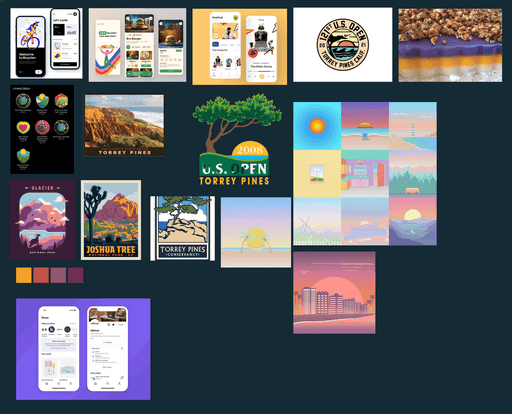
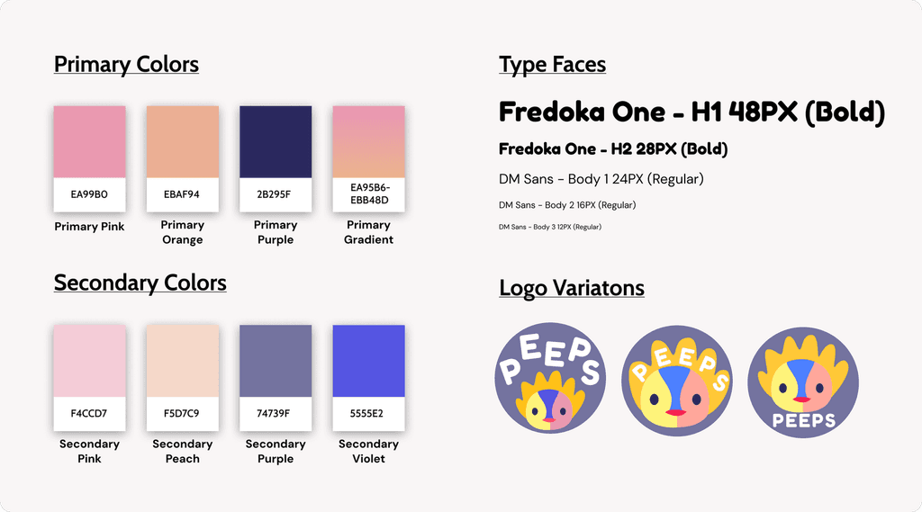
Moodboarding + Style Guide
To kick off the visual direction for our app, I led the creation of a mood board that would shape our aesthetic and guide our style decisions. I gravitated toward the warmth of state park imagery and the minimal elegance of apps like Mercari and Shop—both of which inspired a balance between friendliness and usability.
Hi-Fi Prototyping

User Testing
Following adjustments to our high-fidelity designs, we contacted the primary stakeholders we interviewed during our initial research phase to gather direct feedback for further improvement.
In our initial user testing round, we identified areas for improvement and made several changes for better usability:
Revamped the "Bulletin" section layout on the home page
Unified the club/organization sub-page design for consistency
Implemented profile switching functionality for club/organization organizers based on stakeholder feedback
After implementing these changes, we conducted another user testing session with the same participants. Most users were satisfied with the final prototype, though minor errors required attention:
Fixed button issues that redirected users to the wrong tab.
Added gradient accents to improve the app's aesthetics