Gentrifeye
Preserving local heritage by documenting cultural narratives and resisting displacement.
0-1
B2C
MOBILE DESIGN
BRAND DESIGN

Project Overview
Problem
Gentrification—fueled by corporate interests and local policies—has displaced communities, erased cultural identities, and left many unsure how to advocate for themselves. This is especially true in City Heights, a diverse San Diego neighborhood facing ongoing development pressures. While gentrification affects many areas, I focused on City Heights as a practical starting point given our scope and resources, with the intention and long-term goal of growing into a resource for communities nationwide.
As someone who’s seen culture fade from places that once felt untouchable, this work is personal—and a step toward accessible, visible, and empowered advocacy.
How might we create a platform that empowers communities to advocate, stay informed, and protect their cultural identity amid ongoing development?
Solution
Through user research, community input, and iterative design, I created a platform that empowers residents to advocate for their neighborhoods. By sharing personal stories and staying informed on urgent local developments, locals can both reclaim and shape the narratives that authentically reflect who they are.


preview of final mobile Screens


User Surveying & Initial Interviews
I began my research with surveys and preliminary interviews, using a carefully designed questionnaire to uncover the deeper challenges of gentrification. By blending open-ended and structured questions, I gathered firsthand stories while identifying broader community impacts, from housing instability to rising costs.

User Persona
To translate the deep insights gathered thus far into actionable design decisions, I created a persona that accurately represents the lived experiences of City Heights residents, primarily those aged 18 to 32. Grounded in both qualitative and quantitative data, this persona served as an empathetic and relevant reference point that kept the community's goals, frustrations, and values at the heart of every subsequent step taken moving forward.

Lo-Fi Prototyping
After exploring design platforms like Dribbble and Pinterest, where I drew inspiration from modern design trends, I focused on intuitive elements, proven systems, and effective visual hierarchies. I connected these insights to the minimalistic layouts of platforms like Instagram and Twitter/X, aiming to create a design that aligns with these successful styles while maintaining a unique identity.
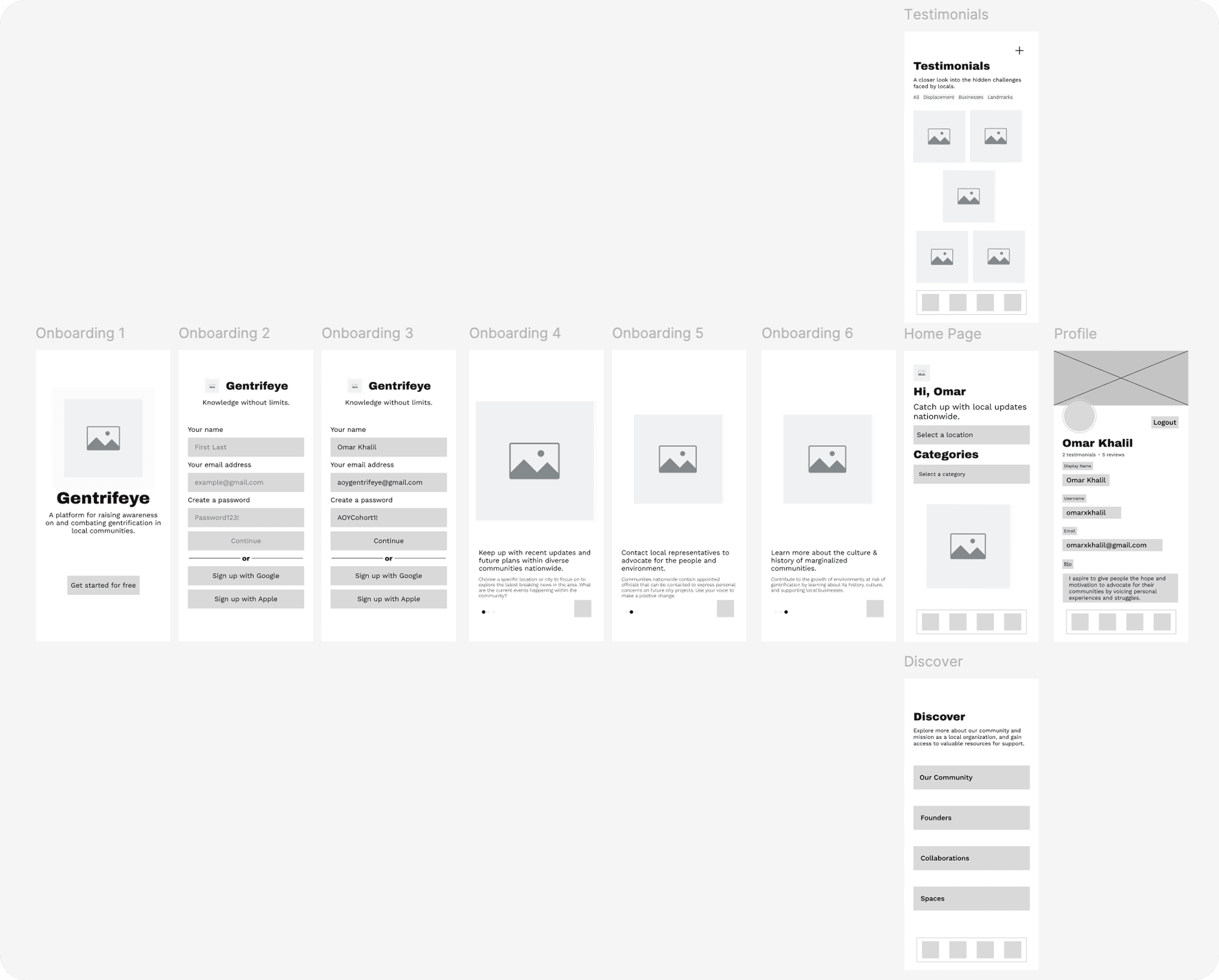
Incorporating feedback from user research, I focused on features that addressed the frustrations and goals of our target audience. Acknowledging their concerns about forced relocation and the loss of community ties, I conceptualized actionable prompts to empower users in their efforts to combat the cycle of displacement caused by development.
To ensure the design was grounded in real user needs, I directly engaged with residents who expressed interest in collaboration during initial interviews and surveys. This helped uncover meaningful solutions, narrowing down four key pages and functionalities that addressed both current frustrations and long-term aspirations.


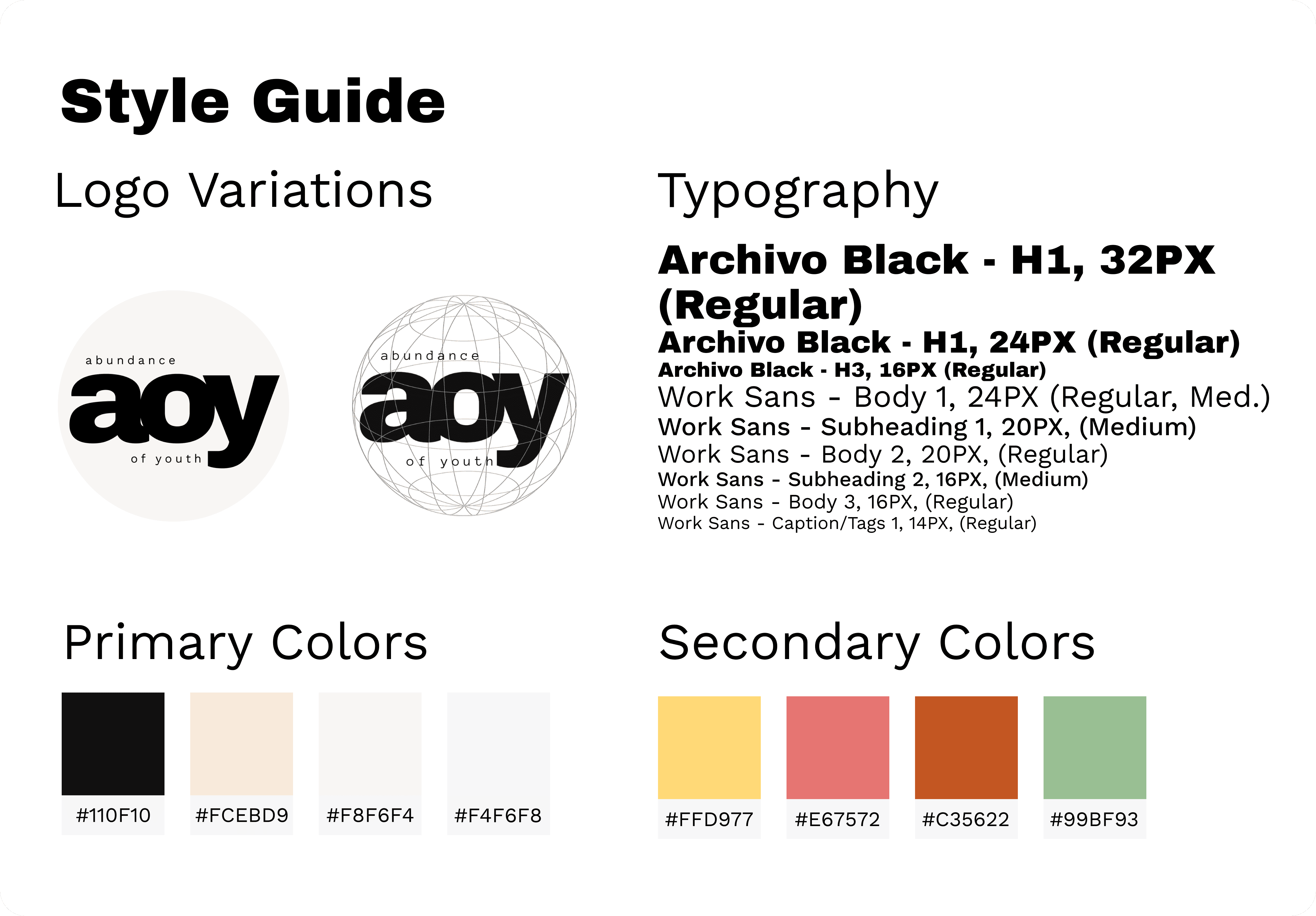
Style Guide
To maintain consistency with AOY's established branding, including core visual assets, fonts, and color schemes, I adhered to their existing style guide throughout the design process. This decision was made to ensure the platform aligned with AOY's identity and could be easily handed off as a lasting resource for the community after the cohort ended. My goal from the start was to create a platform that would remain relevant and serve as a central reference for community members long after the project’s completion.